If you’ve ever opened a streaming website and felt slightly lost—too many buttons, unclear menus, or features that don’t behave as expected—you’re not alone. Most users don’t struggle with content itself. They struggle with how that content is presented and navigated.
This article helps you understand what makes a streaming platform’s user experience (UX) and user interface (UI) feel smooth, intuitive, and trustworthy. We’ll break down how design choices affect real users, what works well, what can cause friction, and what thoughtful platforms aim to get right.
What Do Users Actually Expect From a Streaming Interface?
Most users come with a simple goal: find something to watch and start watching without effort. Everything else supports that goal.
Clarity Over Cleverness
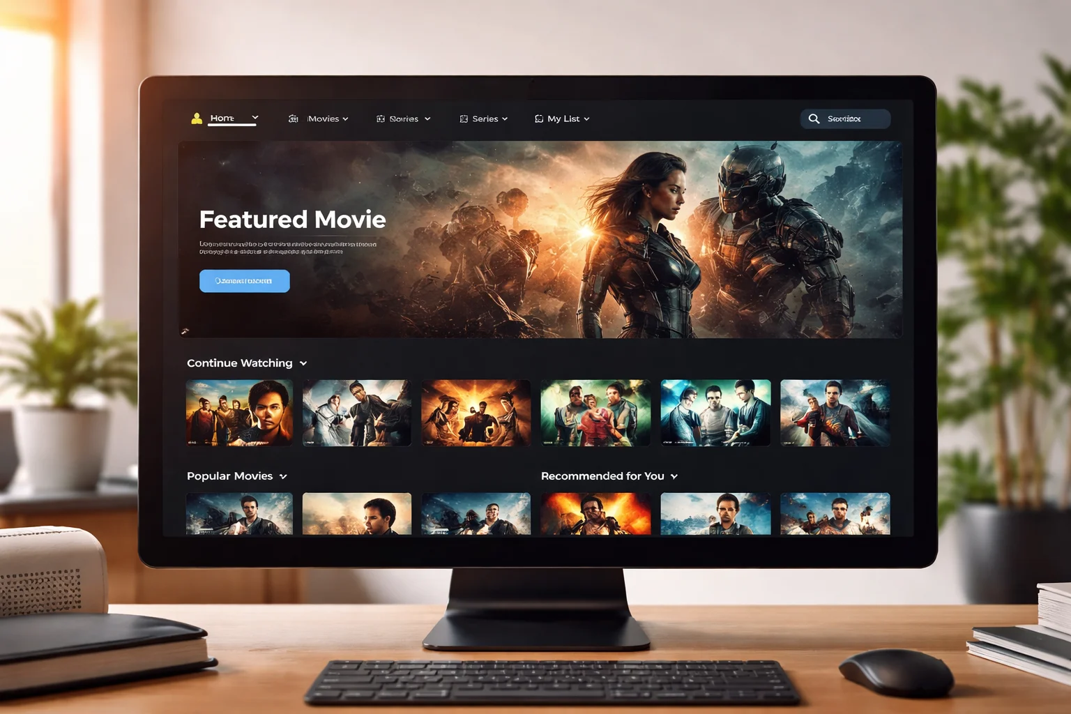
Users prefer layouts that feel familiar. Clear navigation, obvious buttons, and predictable behavior matter more than creative visuals.
When an interface tries to be “unique” at the cost of clarity, users slow down or leave.
Speed of Understanding
A good interface explains itself without instructions.
Users should instantly understand:
- Where to browse content
- How to search
- How to start or resume playback
If these actions require thinking, the experience feels heavy.
How Navigation Design Affects User Comfort
Navigation is the backbone of user experience. If it feels confusing, everything else suffers.
See also How the Voddler platform approaches usability and layout
Logical Content Grouping
Content should be grouped in ways that make sense to real people.
Examples include:
- Genres that reflect actual viewing habits
- Recently watched or saved content placed prominently
- Clear separation between browsing and account settings
When categories feel random or overcrowded, users hesitate.
Consistent Menu Placement
Menus that stay in the same place across pages reduce mental effort.
Users rely on muscle memory. Moving key controls around breaks trust and flow.
Visual Design: More Than Just Looks
Visual design isn’t about being flashy. It’s about helping users feel comfortable and focused.
Readability Comes First
Text size, contrast, and spacing matter more than colors or animations.
Users should never struggle to:
- Read titles
- Understand descriptions
- Distinguish buttons from text
Poor readability quietly drives users away.
Calm, Neutral Design Choices
Streaming platforms work best when the interface fades into the background.
Busy visuals, aggressive highlights, or constant motion distract from content discovery.
A calm interface feels respectful of the user’s attention.
How Search and Discovery Shape the Experience
Search is often the fastest path to content. When it fails, frustration rises quickly.
Predictable Search Behavior
Users expect search results to be relevant, fast, and forgiving.
Small spelling mistakes or partial titles shouldn’t break results.
When search feels unreliable, users stop trusting the platform.
Helpful Discovery Without Pressure
Recommendations should guide, not overwhelm.
Good discovery systems:
- Suggest content based on recent activity
- Avoid repeating the same items endlessly
- Feel optional, not forced
Users like help, not pressure.
Accessibility and Device Experience Matter More Than Ever
Users access streaming platforms across many devices. Consistency matters.
See also Which devices and regions the platform is designed for
Cross-Device Familiarity
The experience should feel recognizable on:
- Desktop
- Mobile
- Tablets
Even if layouts adjust, core actions should behave the same.
Inclusive Design Choices
Simple design supports more users.
Clear icons, readable text, and keyboard-friendly navigation help people with different needs without calling attention to it.
Accessibility is good design, not a special feature.
Where Platforms Often Lose User Trust
Small issues can quietly damage the experience.
Unexpected Behavior
Auto-playing content, hidden controls, or unclear exits create discomfort.
Users want control. Surprises reduce confidence.
Overloaded Interfaces
Too many features shown at once can feel overwhelming.
Good UX shows only what’s needed right now and keeps advanced options accessible but secondary.
A Note on Real-World Platforms
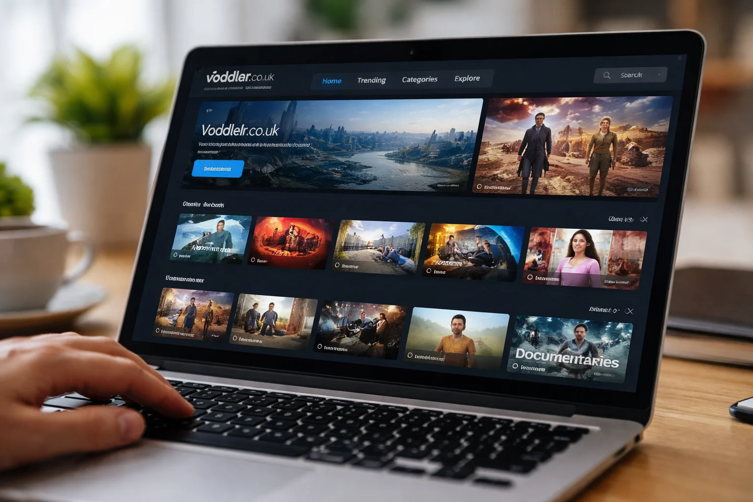
Some UK-based streaming platforms, including Voddler.co.uk, reflect many of these design considerations in their interface approach. When platforms focus on clarity, predictable navigation, and calm visuals, users tend to feel more comfortable exploring content at their own pace.
The goal isn’t perfection—it’s reducing friction.
Frequently Asked Questions
What’s the difference between UX and UI?
UI is how the interface looks. UX is how it feels to use. Good design needs both working together.
Why does a simple interface often feel better?
Because it reduces thinking. Users can focus on content instead of controls.
Can design alone improve user satisfaction?
Yes. Even with the same content, a clearer interface often feels more enjoyable and trustworthy.
Final Thoughts
A strong user experience isn’t about impressing users. It’s about respecting their time, attention, and expectations.
When a streaming interface is clear, predictable, and calm, users don’t notice the design—and that’s a good thing. They find what they want, watch without friction, and feel confident returning.
That quiet confidence is the real mark of thoughtful interface design.


